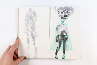
For this project the art co-op send out a blank A5 moleskin to participants who fill it up and send it back. This collection of different artists sketchbooks then forms a library which tours around America starting at the Brooklyn Art Library.
My mum got me one of these sketchbooks for my 22nd birthday to get me back into creating and I'm happy to say that a few weeks back I finally sent it off!!
I used this project as the driving force for the Manifesto Brief as I was struggling to get ideas down on paper. Most of the subjects behind my illustrations are to do with self help, personal thoughts and things that I need to remind myself of as an image maker. I really enjoyed working in this sketchbook and allowed myself to skip from one end of the book to the other to minimise pressure. The pages of the moleskin are really thin which I thought would be an issue at first using pen but once I started working in it I quite liked the reverse side of images bleeding through and used it as a sort of layout guide for the next illustration. I really enjoyed this because it made it feel like the illustrations were communicating with each other blending from one page to the next. I felt those pages worked the best and I intend on making a zine based solely on this idea connecting one image from one page to the next and the next...
Below are some of the pages from my sketchbook.
 |
| Number One |
 |
| Tears |
 |
| Tears |
 |
| The Best Ideas Come at Night |
 |
| Antisymmetric |
 |
| Think Through Making |
 |
| Those Aren't Mine |
 |
| Make Mistakes |
 |
| Feedback |
 |
| Pencil Freaked |
 |
| Where am I? |
 |
| Don't Need to be Saved |
 |
| The Bigger Picture |
 |
| Human Touch |
 |
| Magic |
 |
| Fear of Failure |
 |
| My Crown my Heart |
 |
| My Crown My Heart |
 |
| I Stole Your Crown |
 |
| I'm in Here |
 |
| But I Love You |
 |
| Sky's the Limit |


2 comments:
Your sketchbook is awesome! I also did one with the theme "Lines & Grids" Are you doing one for 2012 too? I'm still planning to although, I haven't actually chosen a theme yet. I had a similar experience with the thin pages--initially I planned to re-bind the book, but I decided to work with what I had, and it actually turned out perfect for my theme!
Hey! Only just seen your comment. Thank you! I was gutted at how they scanned in the images on my book so I didn't go for the 2012 project. Have you done it? I really enjoyed the transparency of the paper in the end I also thought it would be an issue at first!
Post a Comment